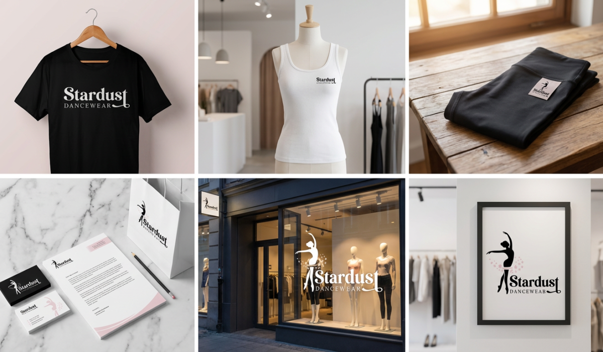
Stardust Dancewear Logo
Stardust Dancewear believes “everyone deserves to feel confident, comfortable, and a little bit sparkly.” Stardust has served the community for over 25 years. Now under new management, the dancewear retailer is serving up the best brand names in dance shoes, classwear, activewear and accessories. The new logo is reflective of the new management and brand direction.
Read More ›
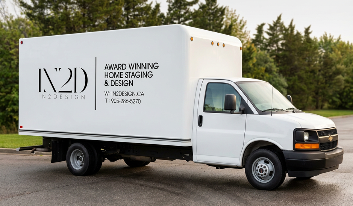
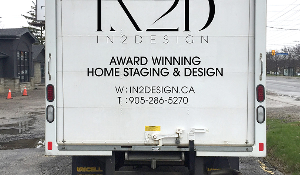
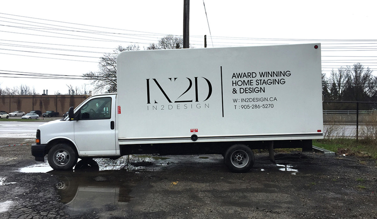
Truck Decal Wrap
In2Design Staging Truck drove across the greater Toronto area fulfilling furniture staging jobs with incredible efficiency and style. The vinyl truck art was designed with their existing branding in mind while sharing contact information to the curious who’d see the truck drive by.
Read More ›
Orion Condo Club Logo
Orion Condo Club was a premium pre-construction condo real estate group focused on the early sales of the best real estate properties in the greater Toronto area. Several design concepts were presented to the team before a final version was selected. Note the 3 circles across the ‘condos’. They are a call to the the Orion constellation, specifically, ‘Orion’s Belt’
Read More ›
Real MG Logo
Real MG is an incredible community for professional women in the real estate industry established by the vivacious Michelle Goodridge. She approached me to design a logo for her group that was professional but also accessible and flexible. The result was a strong wordmark with stylized monogram. It works both in print and stamped over social media. Working with Michelle was a real pleasure. Get it?
Read More ›
Mosaic School Supplies Logo
Mosaic School Supplies is a charitable initiative spearheaded by 2 sisters & a mom. Their mission is to fill pencil cases for students in need, through the donation of gently used school supplies. We pulled together several different itterations of this logo before they were happy with the final version. A very literal interpretation with some classic typesetting in Avant Garde.
Read More ›
In2Design Logo
In2Design supports builder and developer in critical, sales-impacting design decisions, and works directly with buyers to make design choices for their new home. In2Design was in a position for a re-brand. In an effort to align with their builder partner’s vision of elevated designer spaced. We went through multiple concepts, even flirted with a new name, before ultimately coming to this version of the logo. An elegant, contemporary design that reflects luxury and style.
Read More ›
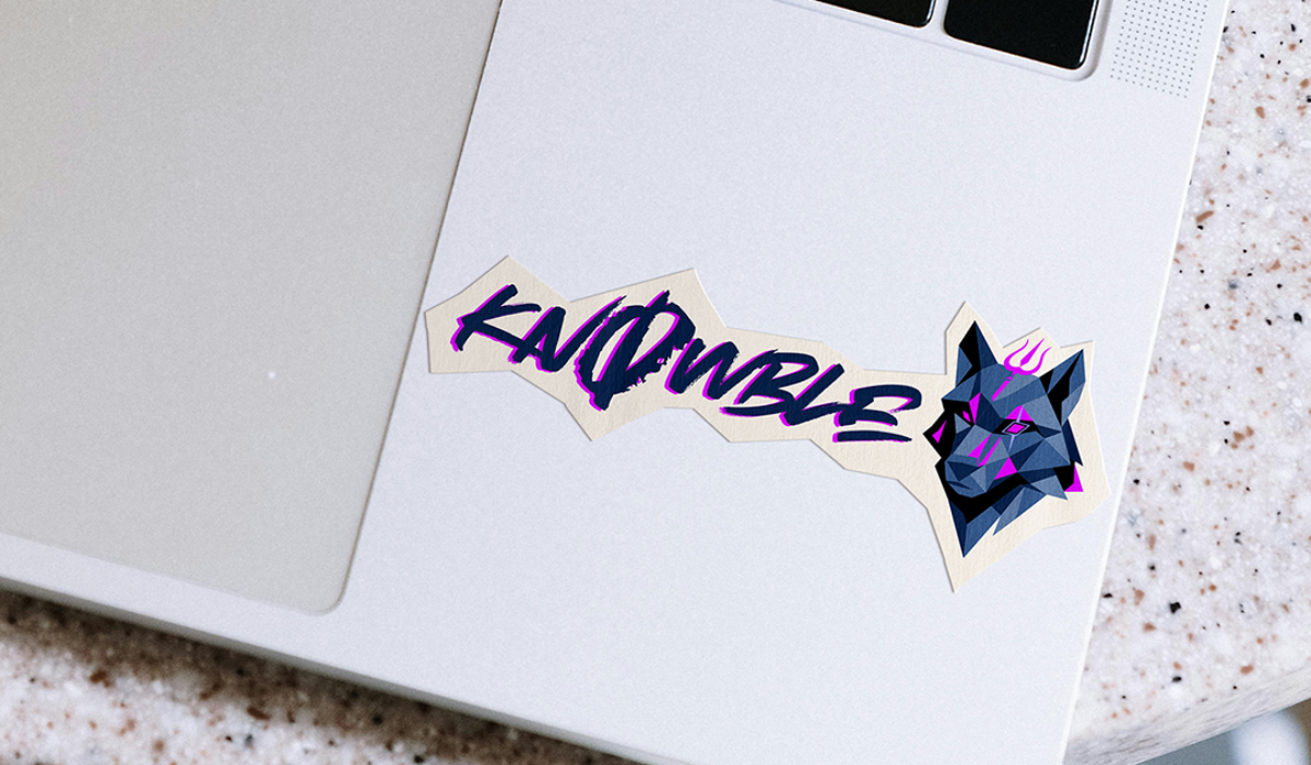
KnOwble Logo
KnOwble is a relatively new electronic music artist out of Halifax, Nova Scotia. Using analog techniques, his style combines warm, gritty, hardware-driven tones with fast, rhythmic structures resulting in a raw and hypnotic sound. KnOwble wanted a logo that was reflective of the online community that supported him through his creative exploration. His love for dogs and Indian heritage were also important to him. This logo was incredibly challenging to bring together all the different elements. In the end, the client was very happy with the final concept.
Read More ›
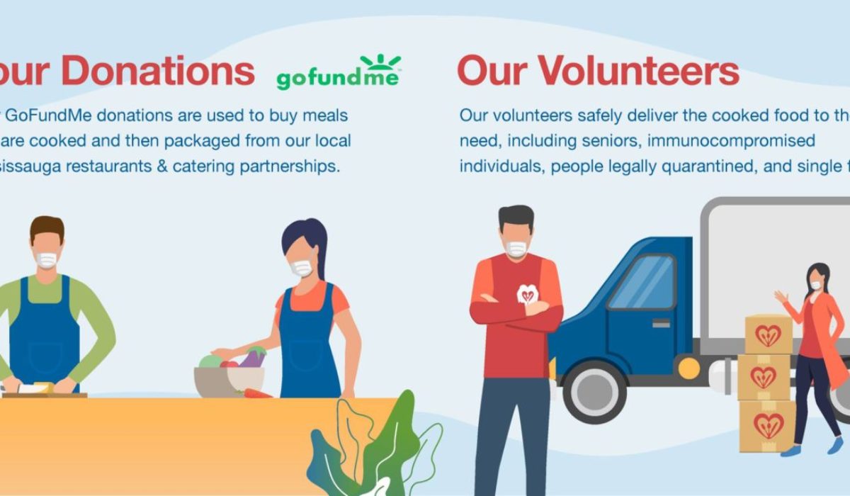
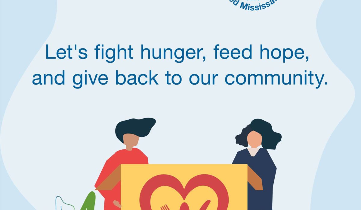
Feed Mississauga Logo
Feed Mississauga was founded during the pandemic. The organization worked with businesses and community members to create fundraisers to feed those who need help. All the donations go towards charities, food banks and other Mississauga based organizations. I was assigned to develop marketing material for the group but quickly discovered that they didn’t have a logo. So I took my own initiative to develop a series of logo concepts for the group of stakeholders involved. Once a logo was finalized we moved on to marketing materials which slid together seamlessly.
Read More ›
Emerge Conference – Logo Design
The Emerge National Conference Logo was designed with the rich ancient history of Cancun in mind. I leveraged symbolism from the ancient ruins of Chichen Itza while preserving the original MA Mortgage Architects logo. The decision to incorporate the company logo proved to be a great way to save costs in production of collateral material as some pieces could be reused well after the conclusion of the event. The Quetzal concept didn’t quite make the cut, but was repurposed as the ‘Early Bird’ Icon in subsequent registration email blasts.
Read More ›